Overview
Rashomon is a Japanese-inspired dining concept shaped by a dialogue between tradition and contemporary sensibility.
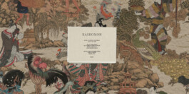
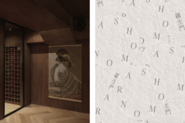
We developed a visual identity and packaging system that draws from Japanese craftsmanship, archival references and the tactile qualities of paper and print, creating a brand language that feels considered, timeless and quietly distinctive.
Services
Visual Identity
Packaging


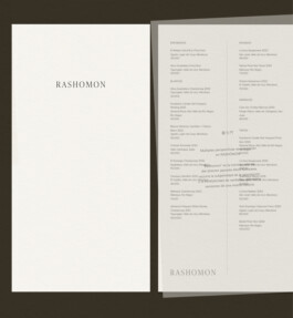
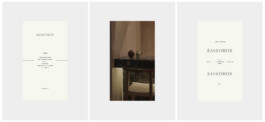
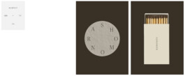
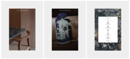
The identity unfolds through a restrained typographic system, where delicate serif details, generous spacing and unexpected compositions create a distinctive visual rhythm. This language extends across menus, matchboxes and printed materials, with each piece adapting to its format while remaining part of a cohesive system. From the larger compositions to the smallest details, every element was designed to feel considered within the restaurant environment.


Services
Visual Identity
Packaging
Overview
Rashomon is a Japanese-inspired dining concept shaped by a dialogue between tradition and contemporary sensibility.
We developed a visual identity and packaging system that draws from Japanese craftsmanship, archival references and the tactile qualities of paper and print, creating a brand language that feels considered, timeless and quietly distinctive.


The identity unfolds through a restrained typographic system, where delicate serif details, generous spacing and unexpected compositions create a distinctive visual rhythm. This language extends across menus, matchboxes and printed materials, with each piece adapting to its format while remaining part of a cohesive system. From the larger compositions to the smallest details, every element was designed to feel considered within the restaurant environment.